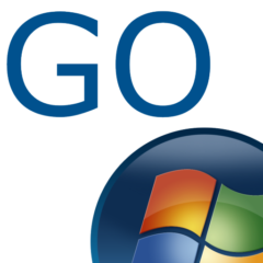
With Windows 8, we approached the logo redesign with a few key goals on mind.
- 1. We wanted the new logo to be both modern and classic by echoing the International Typographic Style (or Swiss design) that has been a great influence on our Metro style design philosophy. Using bold flat colors and clean lines and shapes, the new logo has the characteristics of way-finding design systems seen in airports and subways.
- 2. It was important that the new logo carries our Metro principle of being ŌĆ£Authentically DigitalŌĆØ. By that, we mean it does not try to emulate faux-industrial design characteristics such as materiality (glass, wood, plastic, etc.). It has motion ŌĆō aligning with the fast and fluid style youŌĆÖll find throughout Windows 8.
- 3. Our final goal was for the new logo to be humble, yet confident. Welcoming you in with a slight tilt in perspective and when you change your color, the logo changes to reflect you. It is a ŌĆ£PersonalŌĆØ Computer after all.


